ave you ever seen a big brand without a logo? No? That’s because there aren’t any. A logo has a major impact on how your customers will perceive your brand. So naturally, you want your logo to be outstanding. But how do you get there?
Don’t fret! This handy guide will teach you everything you need to know to design the perfect logo for you and your business. From defining your brand’s identity and understanding what makes a great logo, to making the right design choices and navigating the design process, read on to learn how to design a logo.
Here are the most important steps to designing a logo:
—
You may be asking yourself: How can I design my own logo? These are the steps you need to follow:
- Understand why you need a logo
- Define your brand identity
- Find inspiration for your design
- Check out the competition
- Choose your design style
- Find the right type of logo
- Pay attention to color
- Pick the right typography
- Communicate with your designer
- Evaluate your logo options
- What not to do when designing a logo
- Integrate your logo design into your brand
1. Understand why you need a logo. And why it needs to be great.
—
Business really is like dating—you’re trying to attract the right customers and make them fall head over heels in love with your brand. So think of your logo as the picture on your dating profile. It’s what’s going to make people take interest and try to learn more about you (or swipe left because you’re not for them). So you want to look your best, right?
Your logo will have a huge impact on the first impression your business is going to make: It will give your customers information about your brand and let them know if it’s right for them.
Because your logo is such an essential part of your brand, you want to make sure it’s done well. All your branding materials will have your logo on them. It’ll stare back at your customers from your website, your packaging, and your business cards. Make it count! A great, professional logo design not only has the power to communicate what you stand for. It will also make a good first impression and help you stand out from the competition.
2. Define your brand identity
—
You want your logo to communicate your brand’s personality. And in order to do that, you first need to understand what your brand’s core personality is. Once you have a clear idea of what makes you unique and what your brand is all about, it will be much easier for you to make design choices that complement and complete that picture.
Here are some questions you can ask yourself, to get to the bottom of your brand identity:
- Why did we start this business?
- What are beliefs and values that are important to us as a company?
- What do we do better than anyone else?
- What makes us special?
- If we could describe our brand in three words, what would they be?
- What are the three words we would want our customers to use to describe us?
3. Find inspiration for your design
—
The hardest part of the design process can be the search for logo inspiration. Luckily we’ve got some tips for you that will make it really easy.
Start with a brainstorm

Perhaps you are a conceptual person and like to start off with collecting verbal ideas. A proper brainstorming session can be just what you need to pin down the look and feel you’re trying to achieve. Here are three steps that will help you draw out the best creative logo ideas:
1. Follow the rules of the brainstorm: Brainstorming is about getting all ideas out (even those really really bad ones) and writing them down. Even a horrible idea can spark a conversation that leads to a genius solution.
2. Think like your audience: Make a list of words that describe your brand and how you want it to be perceived. Think like a person in your target demographic and always remember what would be important to them.
3. Get everyone involved: A one-person-brainstorm is fine, but only diversity will make the magic happen. Bring in people from every department or even friends and business partners. The more perspectives, the better.
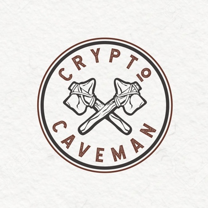

When it comes to brainstorming your logo, don’t be afraid of thinking out of the box and being a bit different. See how logos like the ones for Crypto Caveman and Sweet Trip cleverly combine ideas that you wouldn’t necessarily associate with each other—like cryptocurrencies and cavemen or a honey bee and a pin on a map? These original logo choices help them express character and stand out from the crowd.
Make a mood board
If you’re a visual person, a mood board may be the perfect tool for you to get inspired. You can create an actual board by cutting out and pinning printed images or make a digital one (Pinterest would be the obvious choice here). Simply collect all the images you feel drawn to—those can be other logos, color combinations, illustrations or graphics, go wild! You’ll see, your mood board will reflect what style and design features you are gravitating towards in no time. Need a good place to start? We suggest checking out the 99designs logo inspiration gallery.
Think about how your business can be visualized in your logo. Simply Rooted is all about local, down-to-earth food and their vintage logo perfectly reflects that with hand drawn root vegetables. If you’re striving for a similar aesthetic, your mood board might include images of vintage logos, handmade illustrations and organic shapes and colors. Or take a look how the Rugged logo visualizes their “rugged” brand identity in a bold and rough looking word mark but still includes a luxurious vibe with a reflective gold effect. Your mood board gives you the opportunity to pull all these elements together.
4. Check out the competition
—
The best place to
steal borrow ideas? Your competition! Check out what’s already out there, what works well with your audience and what you should avoid. While stalking those other businesses, think about what makes them different from you and how you can emphasise these differences in your logo design.
Be sure to clearly set yourself apart from your competition. If all the other businesses in your industry are going monochrome, maybe you should opt for some color to stand out. If everyone else is traditional, maybe a fun and modern logo will attract attention.
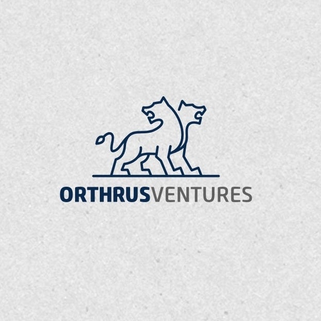
Check out the three accountant logos above and how they communicate their brand personalities. The lion logo for Orthrus Ventures is classic and reliable, while the Tidy Finance logo seems modern and cool. However, if fun and approachable is what you’re going for, let Hot Toast inspire you with its bright color and whimsical illustration.
5. Choose your design style
—
Now that you have a clear idea of your brand and are feeling inspired, it’s time to start translating that into design. There are lots of different elements that come into play here, from colors, shapes and graphics to typography. Isolating each component and what it can do for your logo will help you take things step by step, rather than getting overwhelmed with the whole design all at once.
When thinking about your logo, the first thing you want to do is pick the right design aesthetic for your brand. There is no one style that is right for everyone, only what’s best for your brand.
Classic
Trendy logos can be fun and exciting, but they can quickly look outdated. A classic style gives you better staying power and can help you reach a broader audience. This aesthetic keeps it simple and doesn’t venture out into crazy color palettes, graphics or fonts. A classic style tells people that you are reliable and down to earth.
Retro or vintage
There is a reason why vintage and retro design have been on trend for quite some time now. They instantly remind you of the past and evoke romantic feelings of nostalgia. A vintage logo tells customers that history is important to you and that whatever you sell is done right. Worn and hand-illustrated logos in brown and beige color palettes fit this aesthetic beautifully.
Modern and minimalist
Brands often choose a clean and minimalist style to communicate how fresh and modern they are. This style uses a lot of whitespace, minimal details and simple lines often resulting in sleek, pared back logos. A minimalist and modern style shows your customers that your brand is up-to-date, cool and knows what counts.
Fun and quirky
This is a popular choice for brands with a young (or young at heart) target customer. Fun and quirky style tends to be colorful and cute and often uses symbols or illustrations to create a positive and friendly vibe. Go for a whimsical mascot or a sweet illustration to let your brand’s fun character shine through.
Handmade and handcrafted
Handcrafted style transports a clear message: this brand is individualistic and stands for handmade quality. The style works well in combination with other aesthetics, like vintage, to really drive the message home. But it can be combined with minimal and fun styles as well for a simple and sophisticated or a bright and youthful look.
Can’t pick just one?
Of course these styles aren’t mutually exclusive: Just mix and match them to suit your brand. For instance your brand can be both handmade and fun at the same time, just take a look at how the quirky, illustrated logo for The Crafting Cactus pulls it off.
6. Find the right type of logo
—
In addition to the overall style there are 7 main types of logos you can choose from when you are creating your logo. You can pick the one that suits your company name or overall aesthetic best, or combine them to create something unique.
Lettermarks (or monogram logos)
Lettermark logos can be great to streamline your company logo, especially if your name is very long or hard to remember. Lots of businesses choose to go by their initials, just think of HP, CNN or H&M. These monograms can be great for minimalist logos, but remember that they are not very good at expressing what your business is about.
Wordmarks (or logotypes)
Wordmarks are a very straightforward way of using you company name as a logo. To give them personality and recognition value, they are all about typography—just look at the wordmark logo for ONE. If you’ve got a great name for your brand, this could be the perfect way to put it in the foreground.
Pictorial marks (or logo symbols)
Pictorial marks or logo symbols are what we think of when we hear the word “logo”. They are iconographic images that are easily recognizable and represent your brand with an image. You can choose something simplistic or more complex, but make sure to pick a symbol that creates a unique connection to your brand. Oftentimes these are paired with a wordmark (ya know, so customers know your name… at least until you’re on par with Apple and Target in terms of brand recognition).
Abstract logo marks
Instead of a recognizable symbol, abstract logo marks are geometric forms that don’t establish an immediate connection to an existing image but create something entirely new for your brand. An abstract logo mark will condense your business into a symbol that is truly unique to you. The logo for Printy shows how modern an abstract symbol can look, while having lots of personality at the same time. If you want your abstract logo to create a certain mood or feeling, find out the meanings of different geometric logo shapes.
Mascots
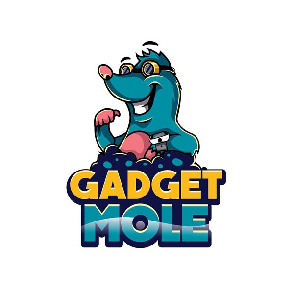
Mascot logos are a fun way of giving your brand a personality. They are often colorful, cartoonish characters that represent your business in a family-friendly and approachable way, like the cheerful Gadget Mole above.
Combination mark
A combination mark does exactly what it says on the tin: it combines a symbol with a word mark to create an easily recognizable logo. The brand name is either placed next to the symbol, or is integrated in the graphic element, like designer ludibes demonstrates with the Brite Side logo. People will associate both elements with your brand, which allows you to use them both alone or together.
Emblem
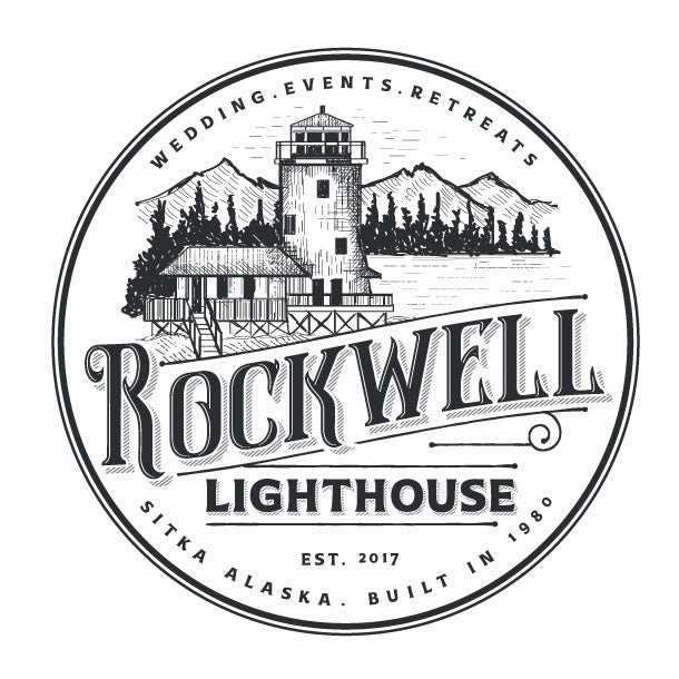
Similar to combination marks, emblem logos are also often a combination of word and pictorial elements. They usually consist of text integrated in a symbol or icon, such as badges, seals or crests. The Rockwell Lighthouse emblem shows, how these traditional shapes can give you a very old-school and classic appearance.






0 Comments